Choosing the
right font for
Your brand
Fonts Speak Louder
Than Words
It took mankind 1,455 years to invent the printing press. Five hundred years later, we went fully digital—with a million fonts at our fingertips. But have we really made progress
Gutenberg revolutionized communication and education with a single typeface: Textura.
Giving a designer 10,000 fonts is no different than handing a monkey a machine gun. Something bad is going to happen.
Inexperienced designers often feel compelled to use all the latest, wildest fonts they downloaded last week. Spoiler: it rarely ends well.
Looking back at the early digital revolution, the result was a kind of bad acid trip that makes Woodstock look like a Victorian dinner party. Compare the work of David Carson in the ‘90s to David Ogilvy in the ‘50s—total opposites. But only one remains the gold standard today.
While I admired the disruptive energy of Carson’s chaos, I knew it had (almost) no place in the hard-nosed world of advertising.
David Ogilvy believed in the power of design—but not design for design’s sake. “If it doesn’t sell, it isn’t creative.”
Between the ‘50s and ‘70s, typography and visual design matured into high art. Think Mad Men. Think meticulously hand-set type. Ogilvy led the charge—not by reinventing the wheel, but by perfecting it. Fonts weren’t chosen because they were trendy—they were chosen because they communicated. Because they sold cars to drivers, dresses to women, cognac to men.
All that with just 68 typefaces in a single black-and-white printed catalogue.

COMPLETE THE FORM TO
BOOK A STRATEGY CALL
"*" indicates required fields
Typeface vs. Font:
What’s The Difference
These two terms are often used interchangeably—but they’re not the same thing.
A typeface is the design: the overall style of the letters. Think Helvetica, Futura, or Garamond—each with its own personality and structure.
A font is the specific version or instance of that typeface. For example: Helvetica Bold 12pt or Garamond Italic 10pt.
A good analogy?
Think of a typeface as a classic song, and a font as a particular recording of that song—with different instruments, speeds, or keys.
So when we talk about building a brand’s visual voice, we’re choosing the typeface that tells the right story—and the fonts that bring it to life across different platforms.
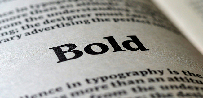
Typography is visual tone of voice
Typography isn’t just about choosing pretty typefaces—it’s about choosing the right ones.
Fonts do the subtle work of communicating emotion and intent. A bold, geometric typeface might say modern and tech-savvy. Elegant serifs might whisper tradition and trust. Rounded sans-serifs might feel friendly, accessible, even playful.
Good typography is felt before it’s noticed. It tells your audience how to read what you’re saying and how to feel about it.
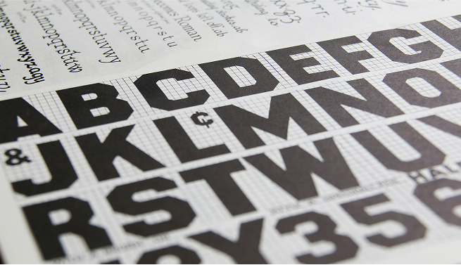
The Building Blocks
of Brand Typography
You don’t need to be a designer to understand the basics of brand typography. Here are a few key elements that shape how your brand sounds visually:
1. Font Families
Fonts come in a few broad styles—and each one sends a different message:
Display fonts are bold and decorative—great for headlines or attention-grabbers, but best used in moderation.
2. Font Pairing
Most strong brands use more than one font—but the combo needs to feel intentional.
Think of it like casting a play:
Balance is everything. Too many fonts = visual chaos.
3. Hierarchy
Fonts aren’t just decoration—they guide the reader’s eye.
Use size, weight, and spacing to show what’s most important: headlines, subheads, body copy, captions.
When done right, your reader knows where to look without thinking about it.
4. Legibility vs. Readability
They’re not the same thing:
That cool-looking font that’s hard to read? It’s bad for your brand. Beauty matters—but clarity wins.
COMPLETE THE FORM TO
BOOK A STRATEGY CALL
"*" indicates required fields
How to ruin a good brand
with bad fonts
Even great brands can mess up their typography. Here are a few common pitfalls to watch for:
1. Using too many fonts
Start with a strong hero font—the typeface that sets the tone for your brand. Then add 1 or 2 supporting fonts max. More than that, and your design starts to feel cluttered, inconsistent, and unprofessional. Simplicity is not only easier on the eyes—it’s easier to remember.
2. Bad font pairing
Two great fonts don’t always work well together. Your fonts should complement each other—not compete for attention.
3. Over-styling
Bold, italic, script, underline, all caps, colors—used all at once? It’s chaos. Restraint is part of good design.
4. Choosing style over substance
Some fonts look amazing in a logo but fall apart in body text or on small screens. If it’s hard to read, it’s not helping your brand.
“Good typography is invisible. Bad typography is everywhere.”
David Jury
The Golden Rule:
Keep Your Logo FOnt sacred
One of the most common—and costly—branding mistakes? Using your logo font throughout all your communications.
Don’t.
Your logo font is the visual signature of your brand. If you start using it for headlines, subheads, body text, or social posts, it loses its punch. It goes from distinctive to generic. You end up diluting the value of your logo.
Your logo needs to stand out. Using the same font everywhere else causes it to lose its distinctiveness and impact.
Use your logo font exclusively in your logo. Build the rest of your typography system around complementary fonts that support—but never copy—its tone.
Let The Fonts Do The Talking
Typography is invisible until it’s wrong. When it’s right, it reinforces your message, supports your voice, and builds trust. It’s part of your brand’s language—one that speaks not just through what you say, but how you say it.
Just like your brand colors set the mood, your typography sets the tone. Choose fonts that tell your brand story—and then use them consistently, confidently, and with purpose.
Great typography isn’t about showing off—it’s about communicating clearly and compellingly. Master your fonts, and you’ll give your brand a unique voice.
As David Ogilvy famously said, “On the average, five times as many people read the headline as read the body copy.”
Choose right. Make it count.
COMPLETE THE FORM TO
BOOK A STRATEGY CALL
"*" indicates required fields